Design Principles / Project 1: Self-Portrait
27.09.2022 – 16.10.2022 / Week 5 – Week 7
Hewr Khaled Mohamed Walid Bayazid / 0337650
Design Principles / B' of Mass Comm (Hons) (Broadcasting)
Project 1: Self-portrait
PROJECT 1 BRIEF
Create a portrait of yourself by applying the various principles that you had learnt through these weeks.
- Contemplate on your life experiences, which includes your culture, your family, your friends, your schooldays, your favourite hangouts, your favourite music, food, musician, etc. Observe your surroundings – people, vehicles, buildings, plants, signages, nature, and activities. Record these in sketches, photography and/or video recording.
- Study all the visuals that you had collected.
- Select visuals that you find relevant and interesting to you, which you can translate into a design work to create a portrait of yourself. Remember to apply design principles in your work. For materials, you may use any of your choice, but do consider their suitability to best express your idea.
DESIGN PROCESS
Visual References
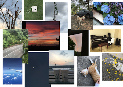
Before working on my self-portrait, the first thing I did was think about the things that define me, the things I liked. After that, I went through photos I've taken of the things that I love/value (the sky, sunsets, flowers, nature, animals,. photography..) and combined them together.
I then surfed through Pinterest to collect images/artworks that described me inwardly, my current mental state and thoughts/feelings.
Lastly, I looked for self-portraits to inspire me and help me as I develop my idea and work on my own portrait.
Idea Exploration & Description
Similar to my references, I decided I would express my current emotional state through my self-portrait. The first thing I did was pick the most appropriate image. To express the lack of purpose/will, I decided to go with a very neutral and characterless photo of mine. I then started experimenting on Photoshop.
This was my first draft:
After receiving feedback from Ms. Noranis, I realised I did not utilise the design principles effectively. I also wanted to explore different ideas, so I started again from zero.
I thought the use of black and white expressed the feelings I wanted to convey more accurately. However, I was still unsatisfied with it. I tried to liquify the scribbles, and while they I liked how they looked, I think it depicted a different meaning/feeling.
After experimenting, I finally managed to create something that I liked, as well as something that accurately expressed what I had hoped to express.
FINAL Self-Portrait
My self-portrait depicts my personal thoughts and feelings. The colours black and white portray the lack of emotions, while the scribbles express confusion and chaos. On the other hand, the 'tears' and the hearts are a hint of hope, resembling the presence of emotions (hence the colours). I personally believe that whether we experience negative or positive emotions, it is an indication that we exist and are alive. When we feel nothing at all, however, we are not so different from the non-living.
In regards to the design principles, I believe contrast is evident with the white scribbles against the black background, as well as the hint of colour of the 'tears' and hearts. The meanings conveyed are also contradicting, depicting contrast. In addition, there is balance as my face is split evenly on both right and left sides of the artwork, but with different elements added to each side to prevent monotony. I also think the scribbles depict some movement.
Feedback
After sharing my visual references and self-portrait draft with Ms. Noranis, she said she liked the scribbles/lines, which she can tell were inspired by my visual references. She mentioned I could improve my work by creating contrast / emphasising any parts of my portrait (eyes, mouth, etc) as the smoke-like overlay (originally clouds) was covering up a large portion of my face.
REFLECTION
Experience
Throughout Project 1, I both enjoyed the process and found it a little challenging. I personally do not have much confidence in my appearance so it was difficult having to create a self-portrait. I also do not easily open up but I value being truthful, so conveying how I genuinely felt was important to me, yet difficult as well. On the other hand, as we had no limitations, I enjoyed experimenting with different styles and choosing what I liked the most and was able to convey effectively.
Observations
During our consultations with Ms. Noranis, I've observed that everyone expresses themselves differently after seeing my classmates' self-portraits. In addition, while working on my self-portrait, I realised that even when we do not intentionally incorporate specific design principles, we unintentionally do so as we try to enhance our work, which I thought was interesting.
Findings
In these 3 weeks, I've learnt that I enjoy the process more and am able to work better when my thoughts and emotions are reflected in my work. I also found out that self-portraits can be helpful and a medium for expressing oneself. Lastly, as we had to incorporate various design principles this time, rather than one, I found that some design principles complement each other while others don't. For instance, it is not easy to create a very harmonious artwork but also incorporate contrast effectively.


Comments
Post a Comment